◂ BACK TO CASE STUDIES

Site Architecture

Consolidating three enterprise platforms into a unified information architecture: 37% fewer content topics, 68% fewer pages.
ROLE  IA & content strategyYEAR  2024SCOPE  58 sites audited
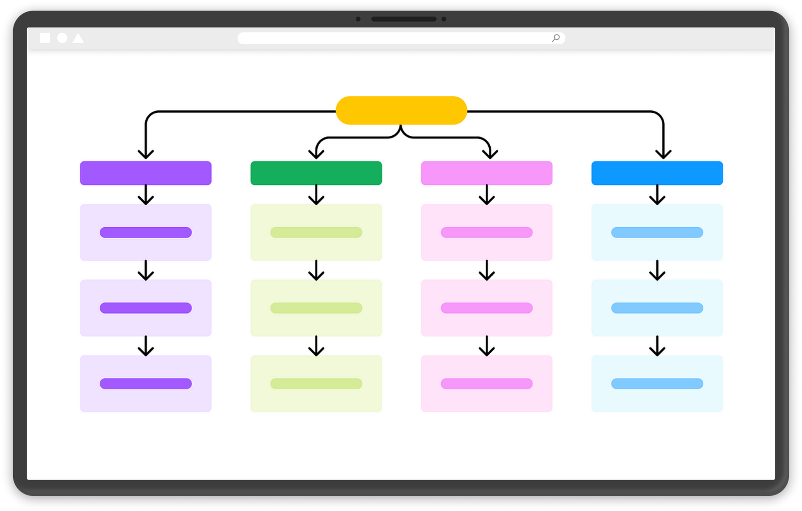
Site hierarchy: one root branching into four color-coded L1 categories, each cascading through deeper levels
THE PROBLEM
Over 9,000 pages scattered and duplicated across SharePoint, AEM, and Bigtincan, with no unified structure to bring them together.
THE OUTCOME
A validated architecture: 60 topics down to 38, 9,000 pages down to 3,000, shipped as the platform's navigation.
THE CONTEXT

One employee experience, three platforms' worth of content.

T-Mobile was consolidating three core internal platforms into a single employee experience, but lacked a unified content structure. Content was scattered and duplicated, making it hard for employees to find what they needed. I owned the inventory, heuristic analysis, and initial categorization for T-Nation, the platform's largest repository: a full audit across 58 SharePoint sites. Then card sorting and business validation alongside UX researchers and content SMEs.

TOPICS
60→38
content topics, 37% fewer.
PAGES
9K→3K
pages, 68% fewer.
VALIDATION
39
employees in card sorts.
CONTENT INVENTORY

Before any architecture decision: a clear picture of everything that existed.

There were no centralized metrics of what content existed, how relevant it was, or how it was used. I pulled metrics for content across T-Nation's 58 SharePoint sites: page volume, engagement, update frequency, access restrictions, and content type. Partner teams ran the same process on the other platforms.

Example: the T-Nation inventory, the platform's largest content repository.

SITE COMPLEXITY
High. Diverse content structures across 58 SharePoint sites, with complex sub-navigation throughout.
UPDATE FREQUENCY
Highly varied by microsite. Reported average for homepages: about once a month.
CONTENT TYPES
Primarily text- and image-heavy resources, documents, news, and training.
ACCESS RESTRICTIONS
Available to all internal employees, with specific restrictions for contract, care, and global service partners.
VOLUME
Over 9,000 pages. 7,850,130 page views in 2024.
ENGAGEMENT
3,500 pages with any views at all: 62% of the collection.
9,000+
pages across the T-Nation collection alone.
7.85M
page views in 2024.
62%
of pages with any visits at all: 3,500 of 9,000.
HEURISTIC ANALYSIS

Five factors decided what migrated, what consolidated, and what got removed.

Using the inventory metrics, I analyzed each content area for migration value. The analysis reduced topics from 60 to 38 and pages from 9,000 to 2,000.

  1. 01
    RELEVANCE
    What is the content purpose and audience?
  2. 02
    ACCURACY
    Is content up to date? Do components function properly?
  3. 03
    COMPLETENESS
    Does it follow design standards? What is the scope end to end?
  4. 04
    ENGAGEMENT
    Is the content visited, and to what degree? How do users interact?
  5. 05
    REDUNDANCY
    Can the content be consolidated or removed?
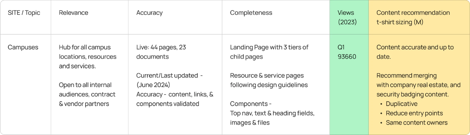
Campuses site heuristic analysis: relevance, accuracy, completeness, views, and content recommendation
Example: Campuses site heuristic analysis
CATEGORIZATION & CARD SORTING

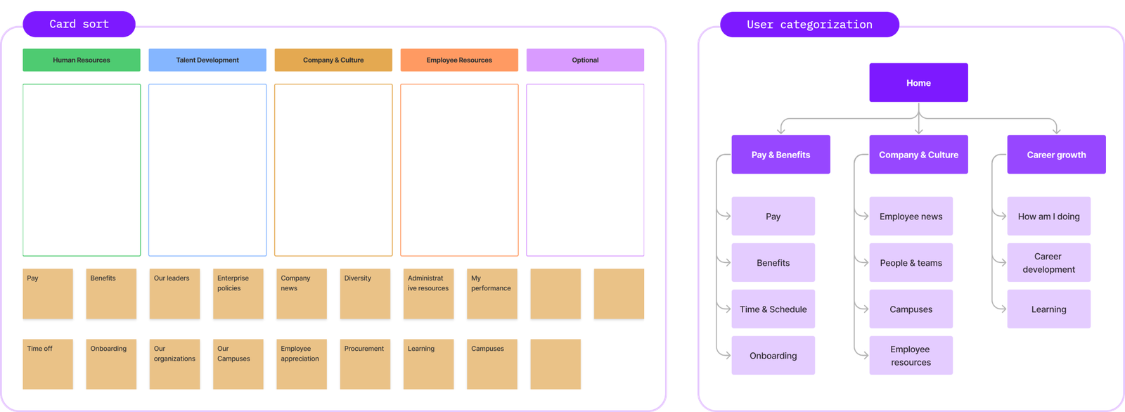
A proposed taxonomy, pressure-tested by 39 employees across three archetypes.

I mapped topics into an initial two-level hierarchy, drawing on existing site maps, SME input, content journeys, and AI-assisted grouping exploration. Then a hybrid card sort: participants sorted into provided groups and could create their own, surfacing gaps and validating whether the structure matched how employees naturally group content.
CORPORATE
38%
back-office employees supporting business functions.
RETAIL
34%
frontline workers serving customers in stores.
CARE
28%
over-the-phone service support for customers.
"I want to be able to find the information I’m used to in a similar place."
CARD SORT PARTICIPANT
"I like that I won’t have to switch between platforms."
CARD SORT PARTICIPANT
"Will I be able to find my most needed resources quickly?"
CARD SORT PARTICIPANT
"I’ve noticed this section has a lot of outdated pages."
CARD SORT PARTICIPANT
The hybrid card sort and resulting user categorization
The hybrid card sort, and how users actually grouped content
BUSINESS VALIDATION

The research went to the people who own the content.

We presented the proposed structure and user-generated site map to content owners and the project team. The first two levels of hierarchy were largely approved, with taxonomy revisions and category re-prioritization. Content teams then mapped the remaining topics and pages into the full four-level hierarchy.
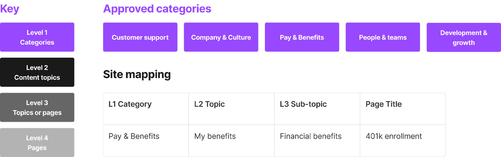
Approved L1 categories and the four-level site mapping
Approved categories, mapped into the four-level hierarchy
FINAL TOUCHES

Placing platform features where the content structure couldn't reach.

With the core IA approved and mapped, I worked with development and platform governance teams to place platform features across top navigation, side navigation, profile, and home page: features addressing gaps research surfaced outside the core content structure.
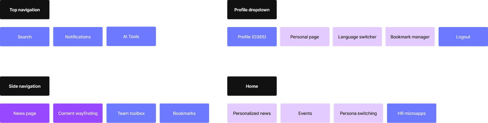
Feature placement across top navigation, side navigation, profile dropdown, and home
Feature placement across the platform shell
WHY IT WORKED
Audit first, architecture second. Every category earned its place with usage data behind it.

The content audit forced a close examination of every page and section across platforms, raising the bar of understanding for all partner teams. It also surfaced the need for a stronger governance model, opening the discussion of how content gets managed going forward.

FROM STRUCTURE TO NAVIGATION

The IA became the platform's navigation. I designed that too, in two weeks.

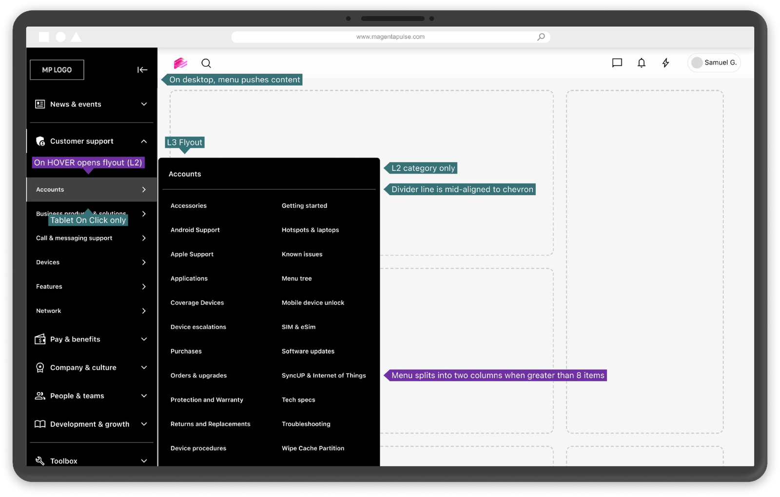
A year later, with delivery behind schedule, I was brought back to design the primary navigation end to end. The side nav surfaces the IA directly: L1 categories always present, L2 revealed on click, L3 in a flyout on hover. Categories expand in place instead of routing through landing pages, and the structure mirrors the site backend dynamically, so content teams manage it without developers.
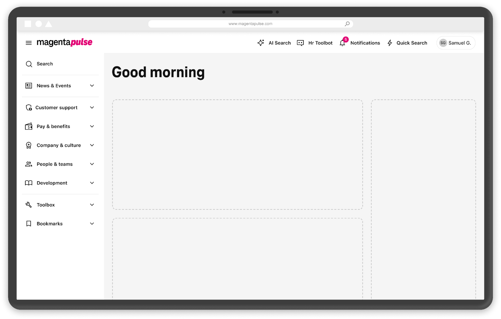
The MVP navigation: L1 categories in the side nav, mirroring the IA
The MVP navigation: the approved L1 categories, live in the side nav
Annotated interaction spec: L2 opens on click, L3 flyout on hover, splitting into two columns past 8 items
The interaction spec: L3 flyout on hover, two columns past 8 items, tablet falls back to click
ONE MODEL, EVERY DEVICE
Desktop pushes page content, tablet overlays, mobile opens each level as a focused view. Frontline employees work primarily on tablets, so mobile-first wasn't optional.
THE LATE CURVEBALL
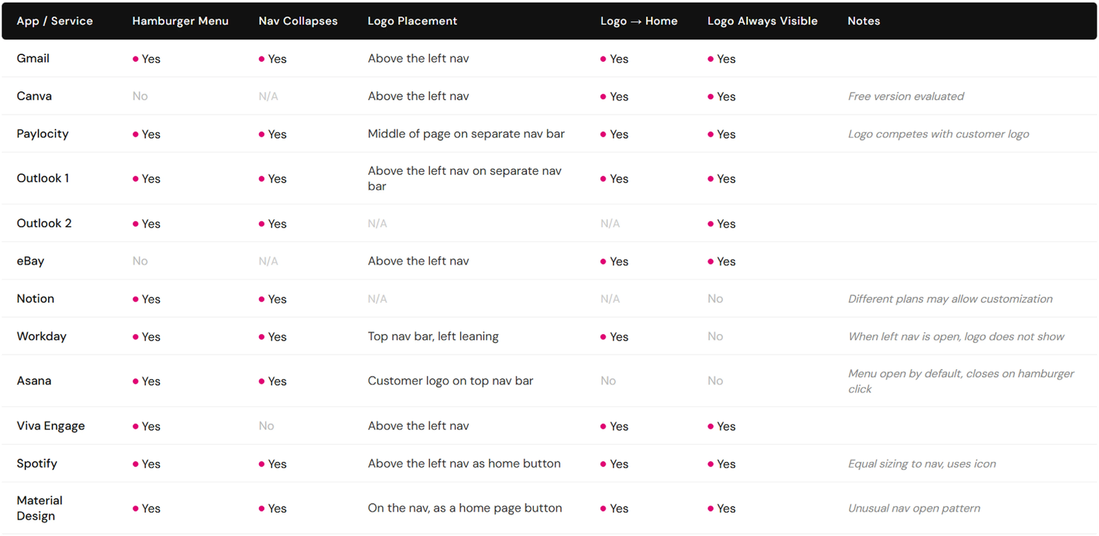
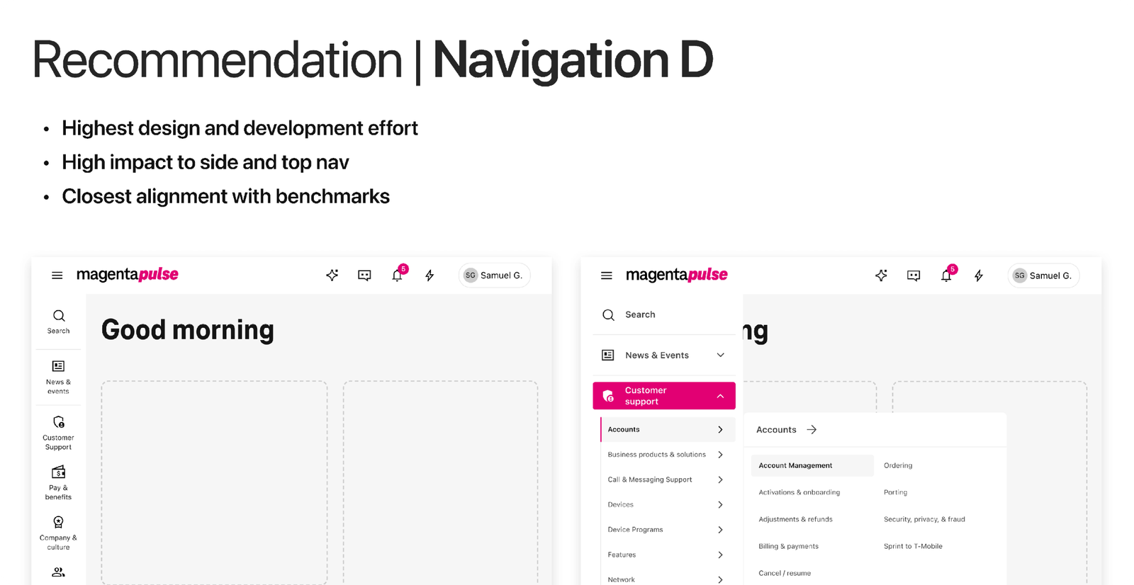
The VP of Brand flagged logo visibility after nav development was complete. Working with a Sr. UXR, I benchmarked logo and nav behavior across widely used services, mapped four options by impact and effort, and turned the selected fix around in three days, through accessibility review and IT handoff.
Competitive benchmarking of hamburger menus, nav collapse, and logo placement across Gmail, Canva, Outlook, Workday, Spotify, and more
The benchmark: logo and nav behavior across 12 widely used services
The selected recommendation, Navigation D: highest impact, closest alignment with benchmarks
The VP's pick: consistent logo visibility across all nav states, shipped in three days
WHY IT WORKED
The IA didn't just inform the navigation. It became the navigation, and one content teams can run.

Because the side nav mirrors the site backend dynamically, content teams manage the structure directly, without developers. Designing for a tablet-first frontline and turning the late logo curveball around in three days kept a behind-schedule launch on track.

RESULTS

A validated foundation for migrating and managing content at scale.

Content topics reduced from 60 to 38: 37% fewer.
Total pages reduced 68%, from 9,000 to 3,000.
Structure validated through user research and business collaboration across three platforms.
Surfaced the need for a governance model, opening how content gets managed and maintained going forward.
Navigation shipped on time for MVP launch: reduced click depth, no developer dependency for updates, a pattern adopted across the platform.
NEXT CASE STUDY · NO.1
Enterprise Permissions: access for 150K+ employees
OPEN →