ScamRanger
Joined mid-build with no clean handoff. Audited the live app, rebuilt onboarding for real activation paths, and overhauled home + learning on a tighter system.
Joined mid-build. Mapped what was actually broken.
Sparse handoff, inconsistent UI, and an older audience the product wasn’t serving well. I audited the live app first: activation sequencing, path confusion, media quality, and accessibility. That pass set priorities for onboarding and the broader mobile overhaul.
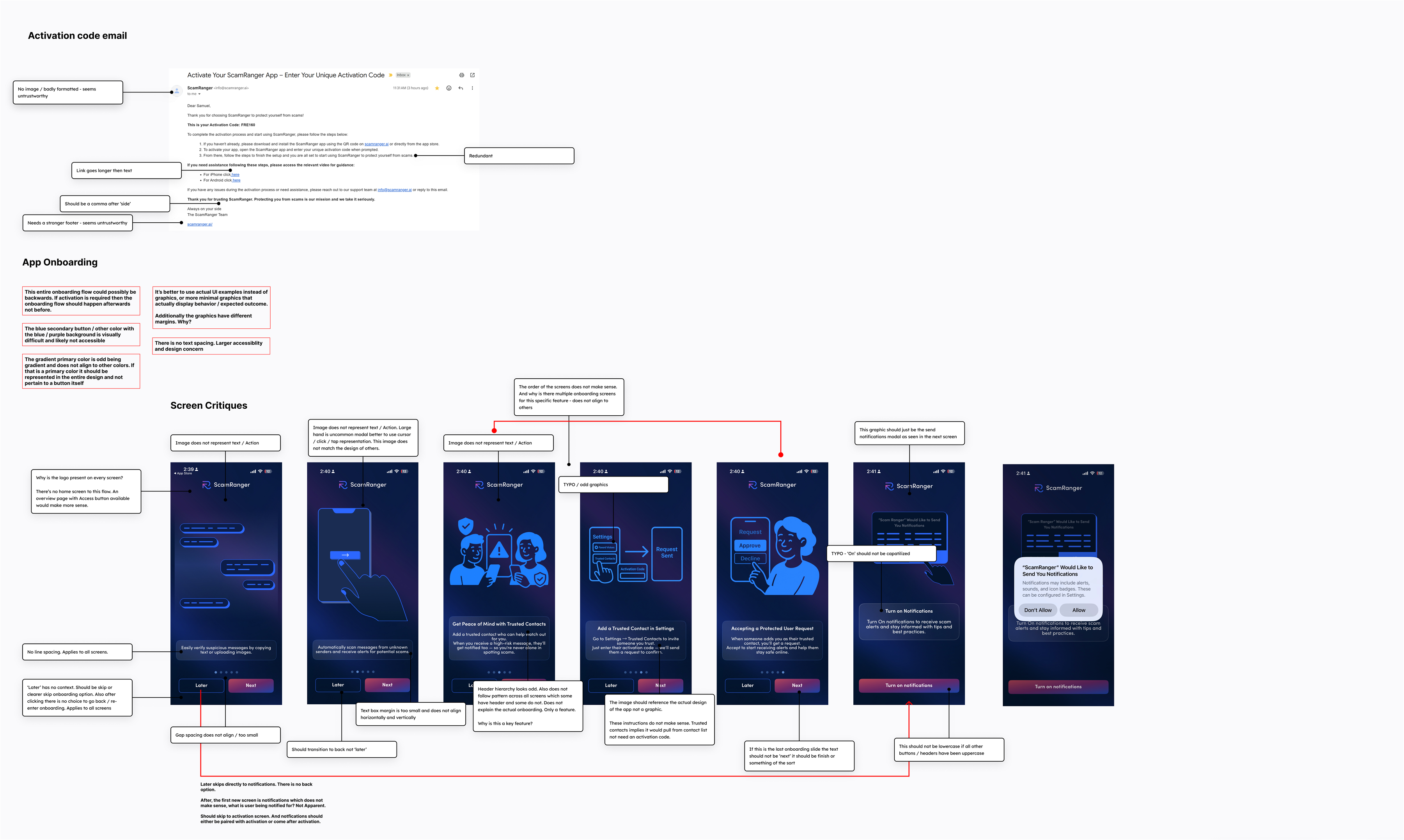
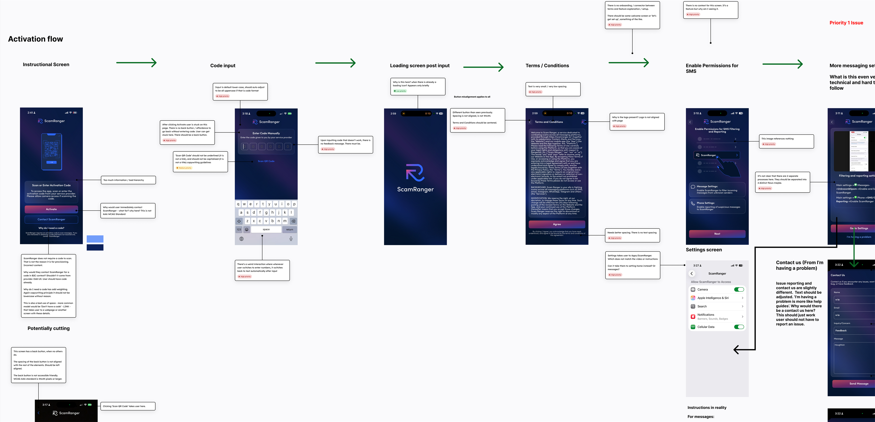
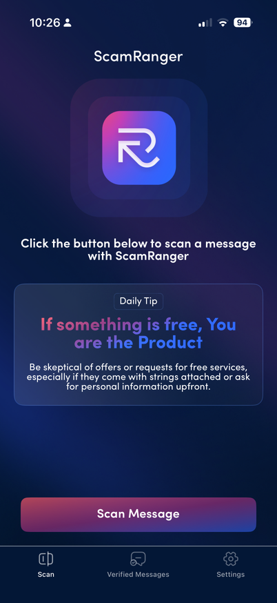
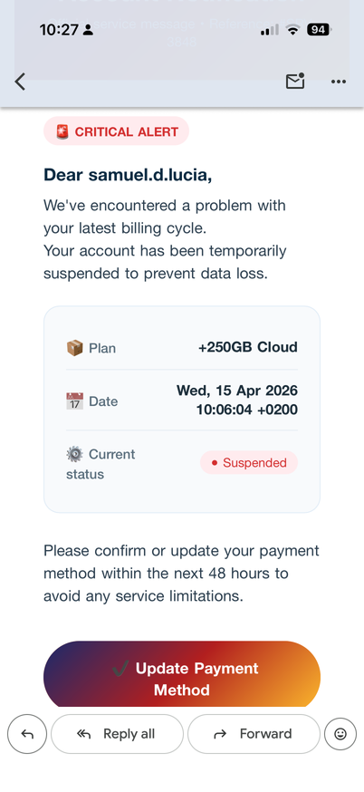
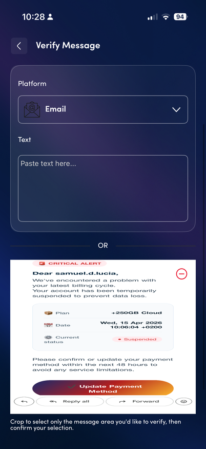
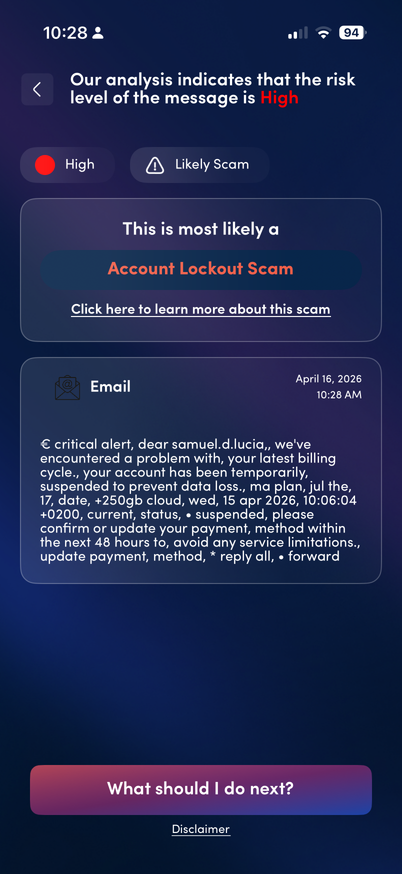
Production UI from the review: hierarchy, contrast, and tap targets.
Branch the entry. Wire the steps. Borrow what works.
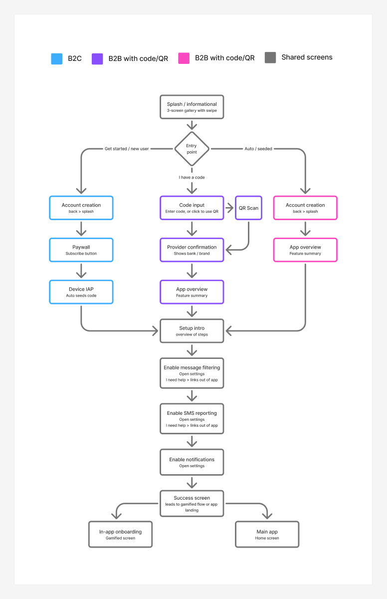
Production forced everyone through one linear path. The redesign splits B2C purchase, B2B code/QR, and seeded/auto, then shares setup downstream. Lo-fi locked step order before polish, checked against patterns from Calm, Headspace, and similar onboarding, and absorbed CEO direction pivots (including blue to purple).
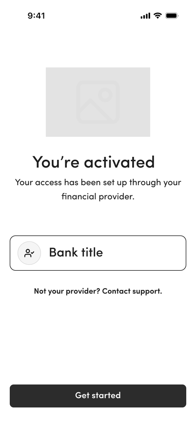
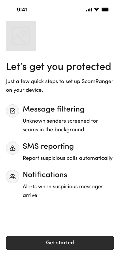
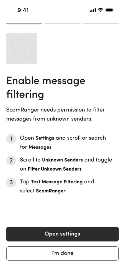
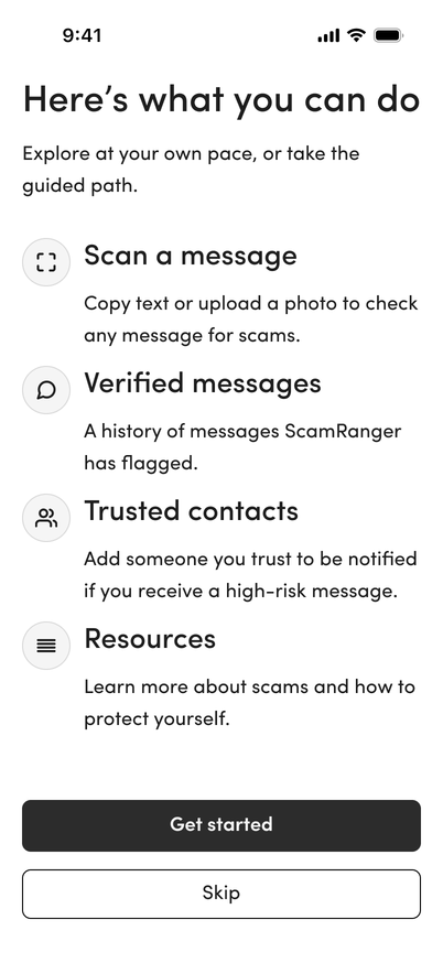
Lo-fi B2B sample: activation, setup overview, filtering, first-run home.
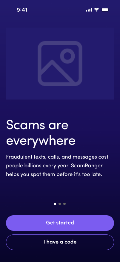
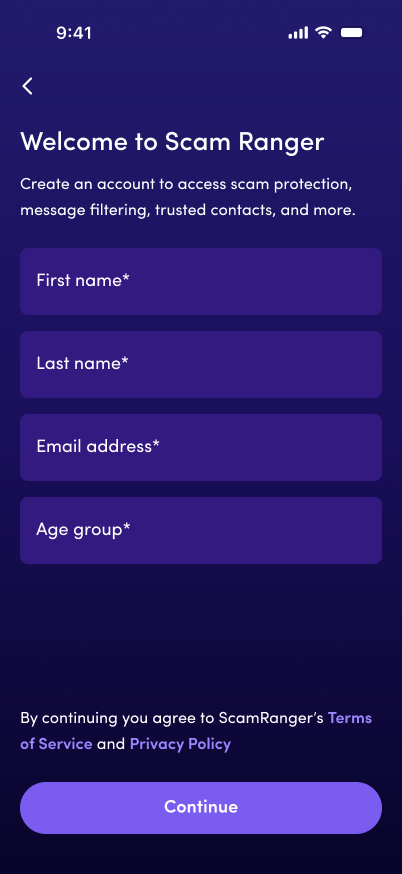
Consumer path: value, account, then paywall.
Featured here is the B2C purchase route. Commitment lands after account creation. B2B branches share setup screens downstream: same system, different entry.
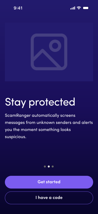
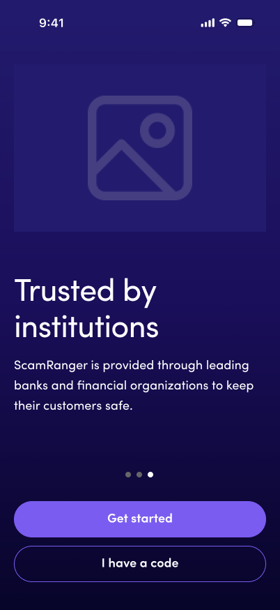
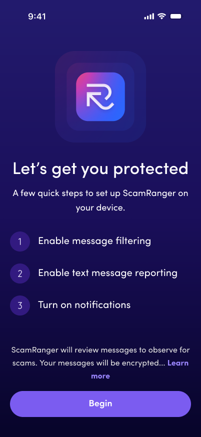
Iteration, then a customer veto.
First pass put scan higher in the stack, added a dismissible daily tip, and dialed back the logo. A bank-trust path followed: Get started, From your bank, tip pushed lower. Customer veto: no X on the tip, bring the logo back, keep the page simpler. Final pass restored brand presence and a quieter tip. Scan stays the primary action at the bottom.
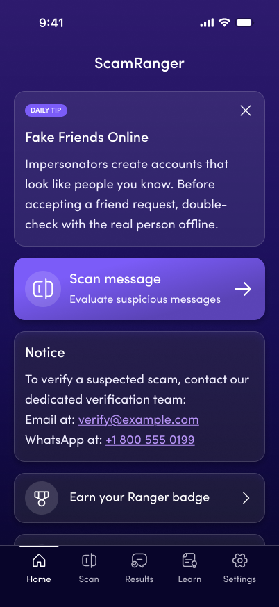
Iteration 1, rejected: tip X, logo reduced
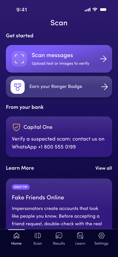
Iteration 2, bank trust / Get started
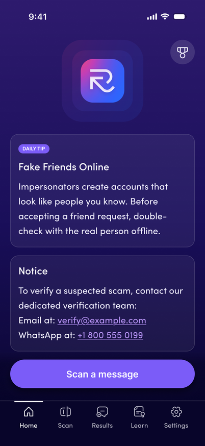
Revised: logo back, no tip dismiss
Long-term vision vs. what shipped on time.
I proposed a richer Learning surface: editorial hub, favorites, Scam Library, and insight articles. For a quick client turnaround and an easier lift for engineering, we shipped a simpler Learning Lab: three entry cards into Safety insights, scam types, and skill building, then those secondary screens. Same job, smaller build.
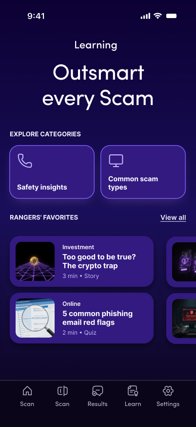
Proposed: hub, editorial + favorites
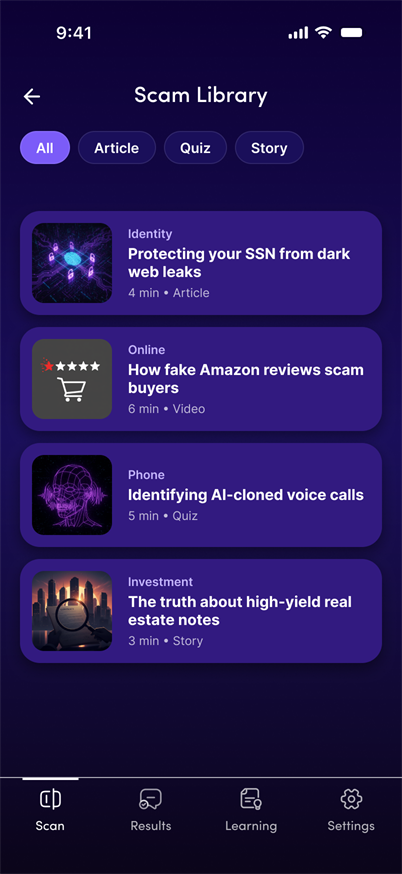
Proposed: Scam Library
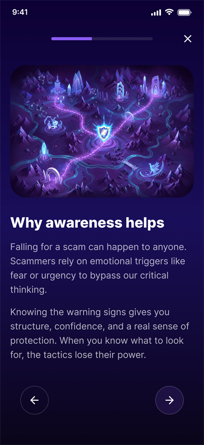
Proposed: insight article
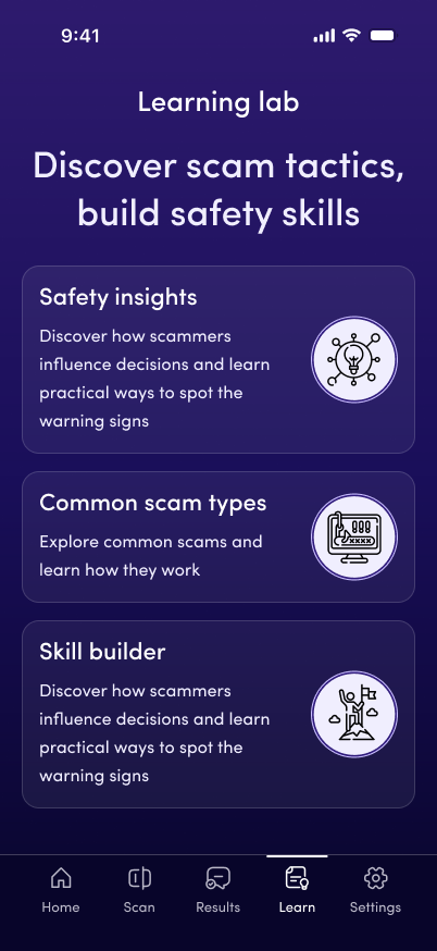
Delivered: Learning Lab hub
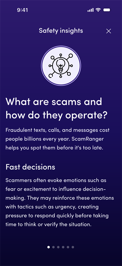
Delivered: Safety insights
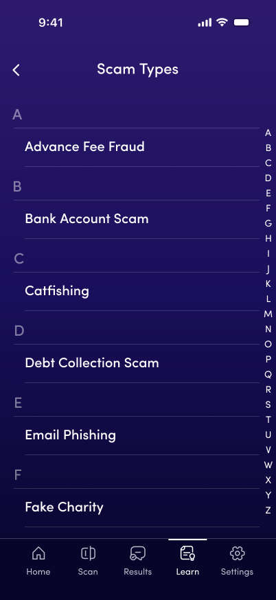
Delivered: Scam types
A slice of the purple system, not the full library.
Tokens, a few core components, and the rules that mattered for handoff. Locking those base patterns early made it cheap to retheme the whole product: first blue, then this purple at the CEO’s request, without redrawing every screen. Snapshot only; not every state or component.
Color & type
Key tokens only. Background runs a 221° gradient across the three bg values.
Core components
Five building blocks used across onboarding and the app. Live CSS, no screenshots.
Button
44px min height, 18 Semibold, primary #7B5CF8, press #9B85FF, disabled #5533CC
Input
Fill #321A80, error #FF8080, solid hex only, no opacity washes
Step bar
Step 3 of 5, Enable protection
Setup progress without implying permissions can be skipped
Icon circle
 Scan
Scan  Shield
  Chat
Chat  Medal
Medal From the ScamRanger Design System icon set: circle fill #321A80, icon #C9BDFF
Rules that kept the system honest
The constraints that mattered more than shipping every token.
Solid hex only. Opacity over gradients caused inconsistent contrast on production screens.
Older target audience. Caption/label at 14px only for secondary chrome.
Buttons, links, and icon hits meet WCAG touch guidance, including secondary actions.
In-screen margins and element gaps follow a 4px rhythm for handoff clarity.
Terms sit next to the action that creates the account, not a standalone interrupt screen.